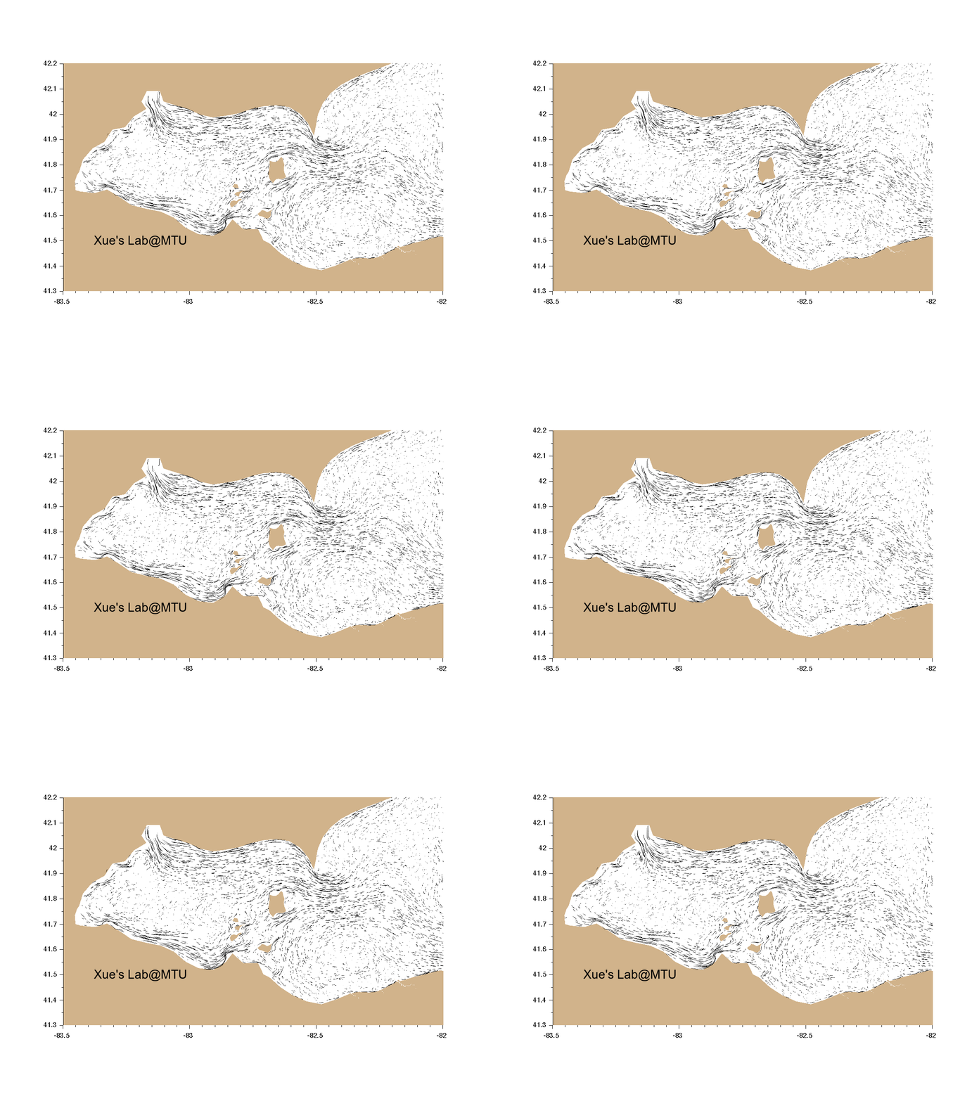
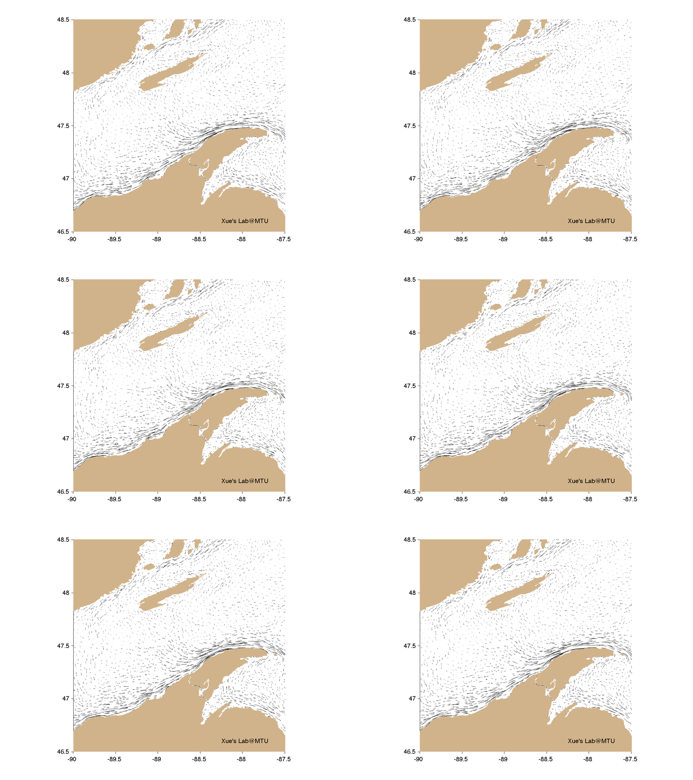
Model Visualization is a meaningful and powerful approach to present modeling results to anyone at the first place, which helps stimulate our enthusiasm and devlope our scientific insights. It is also a key to converting complicated model results to intuitive sense to the undergraduates. One of my interests is developing visualization packages for viewing numerical model results. Please find below some examples of model visualization.
Watch in full-screen mode for best visualization!
Demo of the model simulated transport of oil and oiled shoreline during the wintertime
Demo of summer circulation in Erie.
Two-layer flow in the Straits of Mackinac of Lake Michigan-Huron.
Strong wave in Lake Superior on 10/24/2017.
Summer Keweenaw Currents in Our Backyard. Notice this is a demonstration of the monthly-averaged flow pattern in July (Animation looped).
This is a DEMO of the Particle Trajectories in the surface water.
This is a DEMO of the river plume near Cleveland coast, two large plumes occurs in late July due to the high discharges.
This is a DEMO of the surface temperature (represented by color) and currents (represented by arrows) in the Lake Superior, right in our backyard. This is one of the primary research regions that I am currently working on. The water opactiy is set to 0.9, so that lake bathymetry can be visulaized as well. The model is now on the stage of validation, more accurate results will be presented soon. Here you may have got a flavor of the complexity of the flow structure in our "Back Yard".
This is a DEMO of the surface temperature (represented by color) and currents (represented by arrows) in the Lake Huron-Michigan, one of the primary research regions that I am currently working on. The water opactiy is set to 0.9, so that lake bathymetry can be visulaized as well. This model is developed by MTU-NOAA joint efforts.
I will upload more examples soon!


